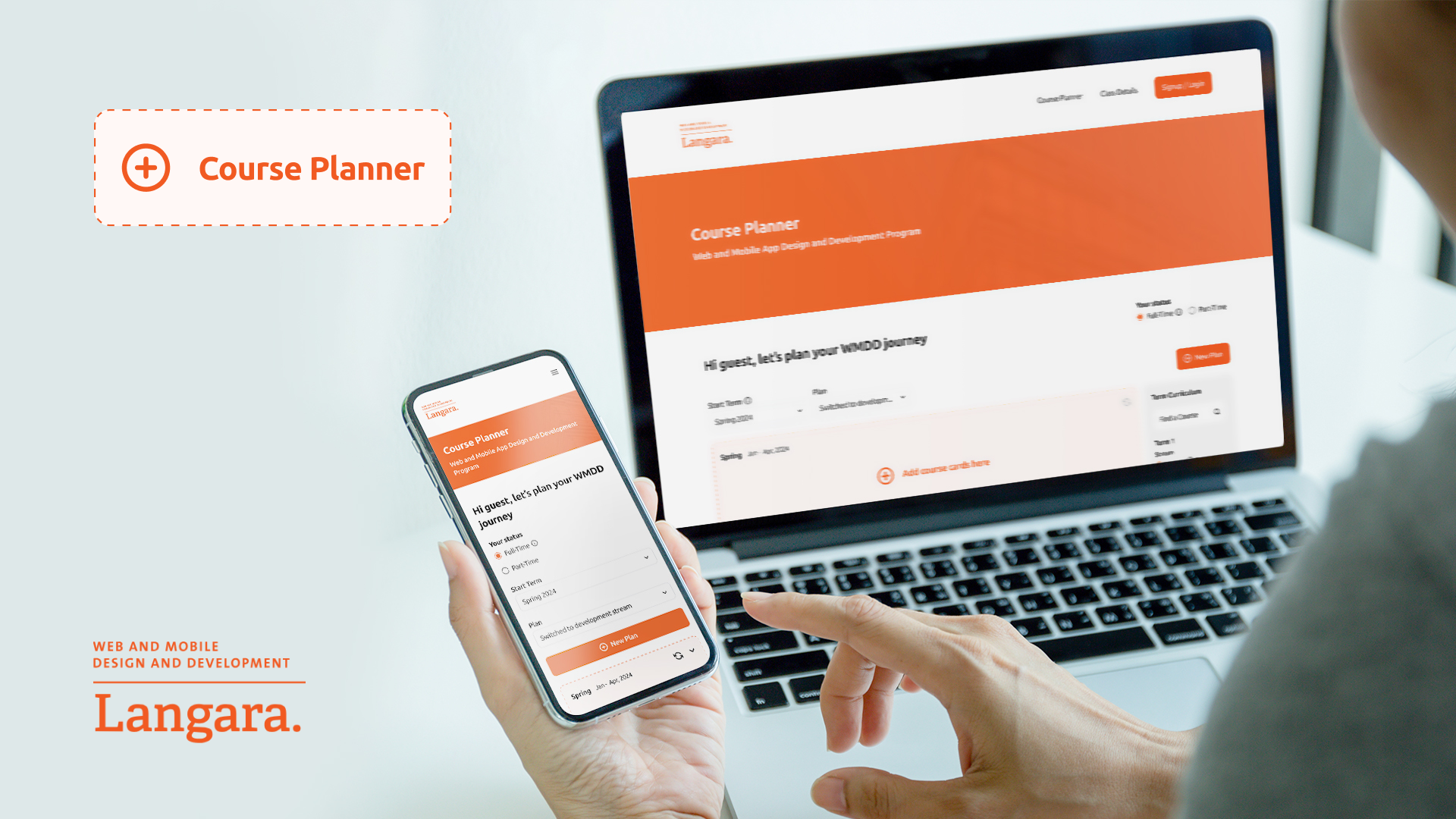
Course Planner
– Langara College
Role
Lead Product Designer
This guide defines the visual language, design style, and principles that shape a clear and consistent brand experience, no matter the team or area of expertise.
At its core, Redo is about precision and clarity—just like our mission to correct financial errors and optimize balance sheets. This guide lays out the essential design standards that bring our brand to life, from our color system and typography to accessibility benchmarks and documentation.
Whether you're designing for digital platforms or printed materials, these guidelines ensure every touchpoint reflects the trust and efficiency at the heart of Redo.
Contents
07
Challenges
01
Target Users
- Stakeholders (Course Coordinator)
GOAL
Reduce repetitive inquiries and manual spreadsheet management
PAIN POINTS
- Manual spreadsheet management
- Time-consuming, repetitive communication
- Lack of scalable, automated planning tools
- Students (Domestic & International)
GOAL
Plan courses efficiently while meeting graduation and visa requirements
PAIN POINTS
- Confusion about prerequisites and co-requisites
- Difficulty planning multiple terms in advance
- Lack of clarity on credit requirements for visa compliance
- Manual, error-prone processes
02
Initial Thinking
We aimed to design an intuitive, self-service planner that would:
- Simplify academic planning for students
- Reduce coordinators’ repetitive workload
- Ensure compliance with institutional and visa requirements
RESEARCH METHODS
- Stakeholder interviews
- Student surveys and one-on-one interviews
- Observation of existing spreadsheet-based workflows
03
Design Process
- User Research
- Problem Definition
- Opportunity Framing
- IA restructuring
- Wireframing & Prototyping
- Usability Testing
- Iterations
- Delivery
04
Discovers
We aimed to design an intuitive, self-service planner that would:
- Confusion about course requirements: Students missed prerequisites and co-requisites.
- Difficulty in long-term planning: Lack of visibility across multiple terms.
- International student compliance: Uncertainty about credit loads required for visa status.
- Manual process: Time-consuming spreadsheets and constant back-and-forth with coordinators.
Incorrect Usage
05
Iterations
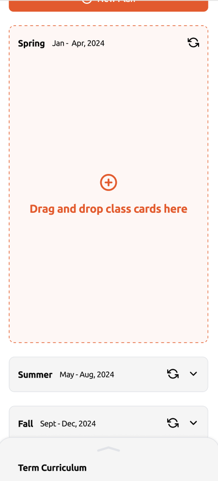
Iteration 1 – Term Board Layout
BEFORE
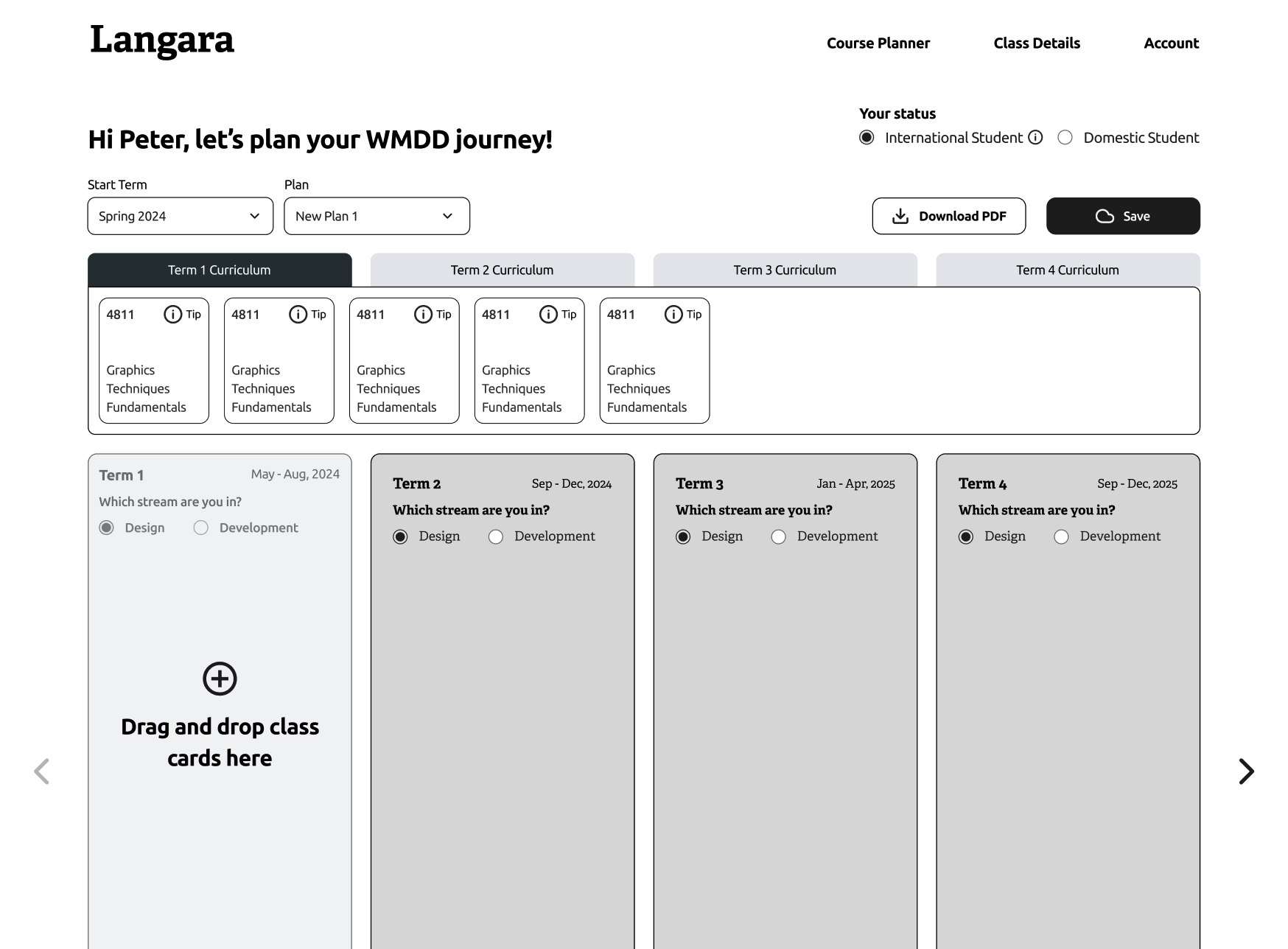
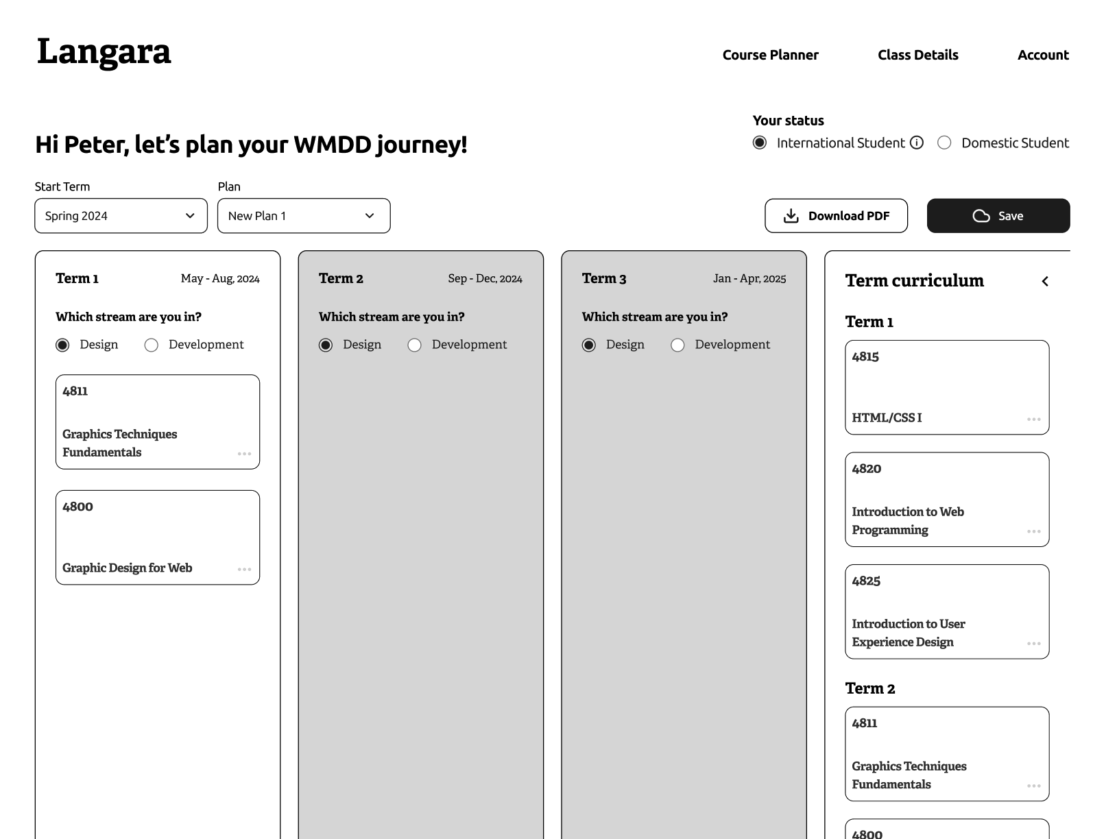
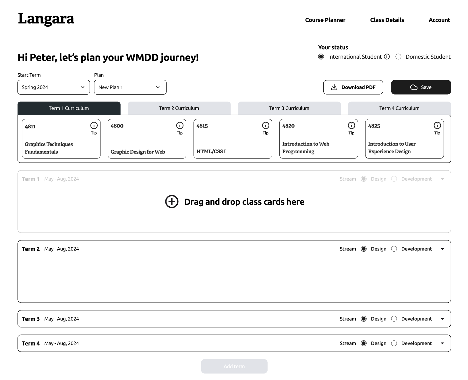
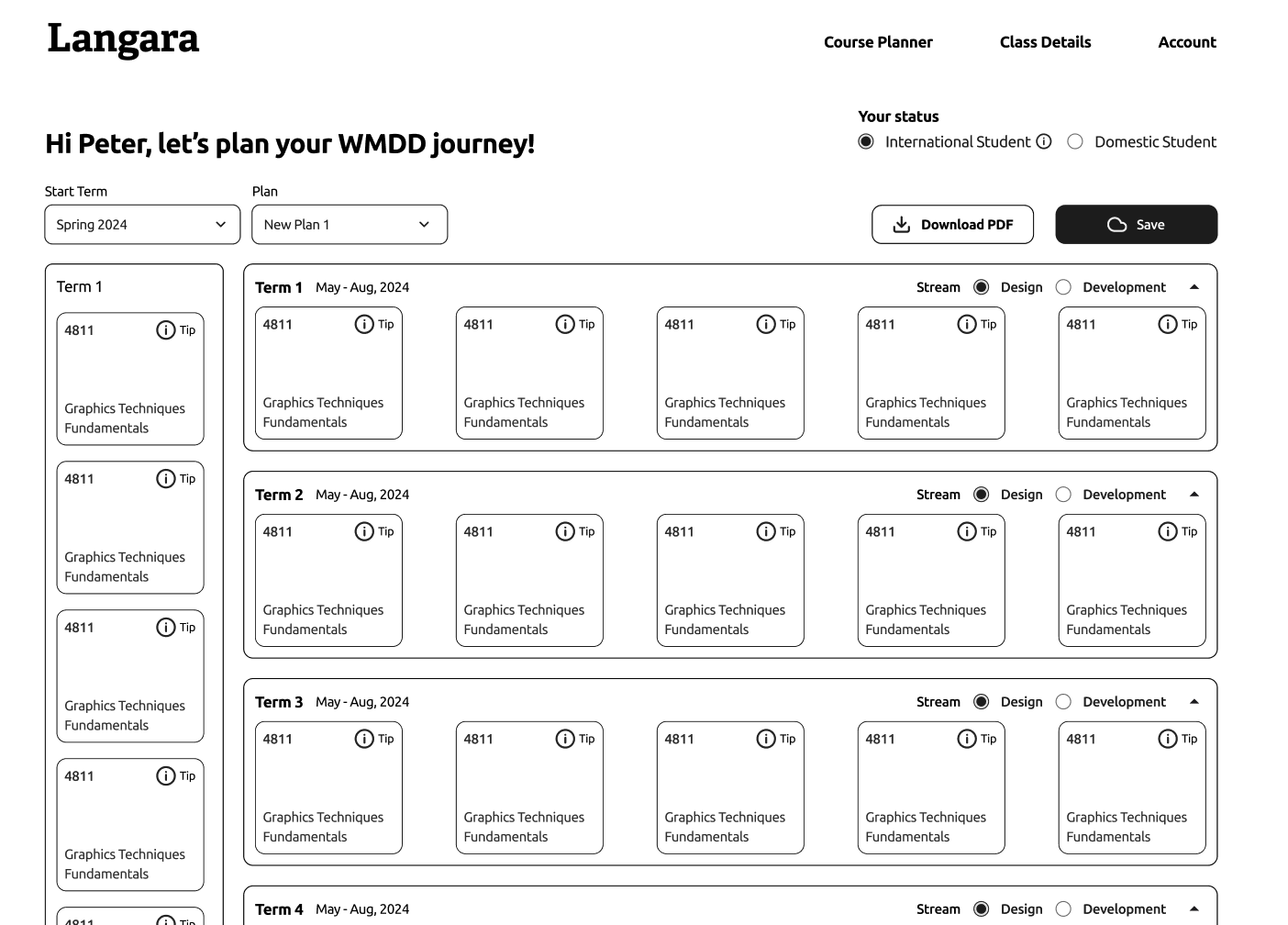
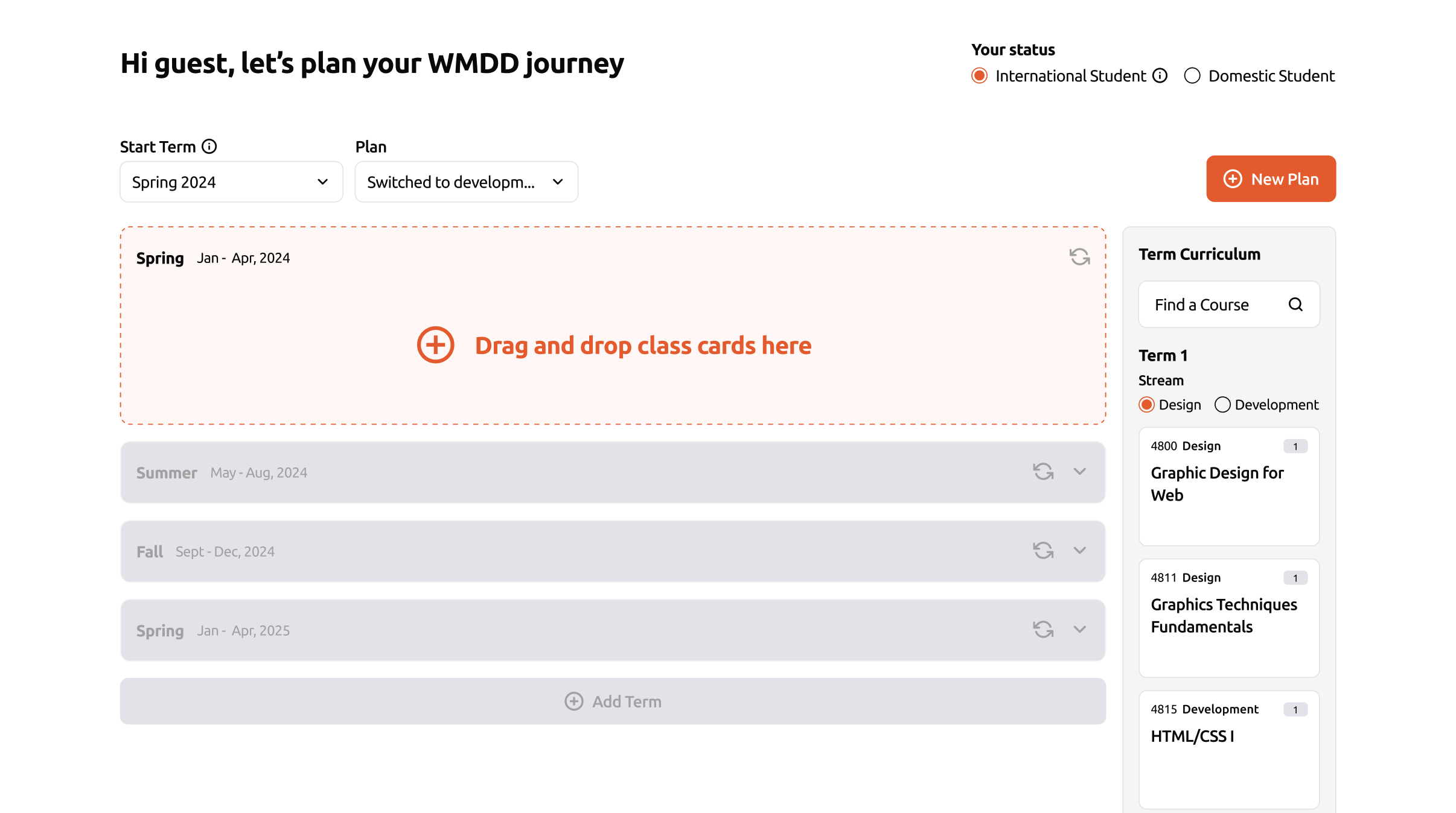
A horizontal board became unreadable as the number of enrolled terms grew.

AFTER
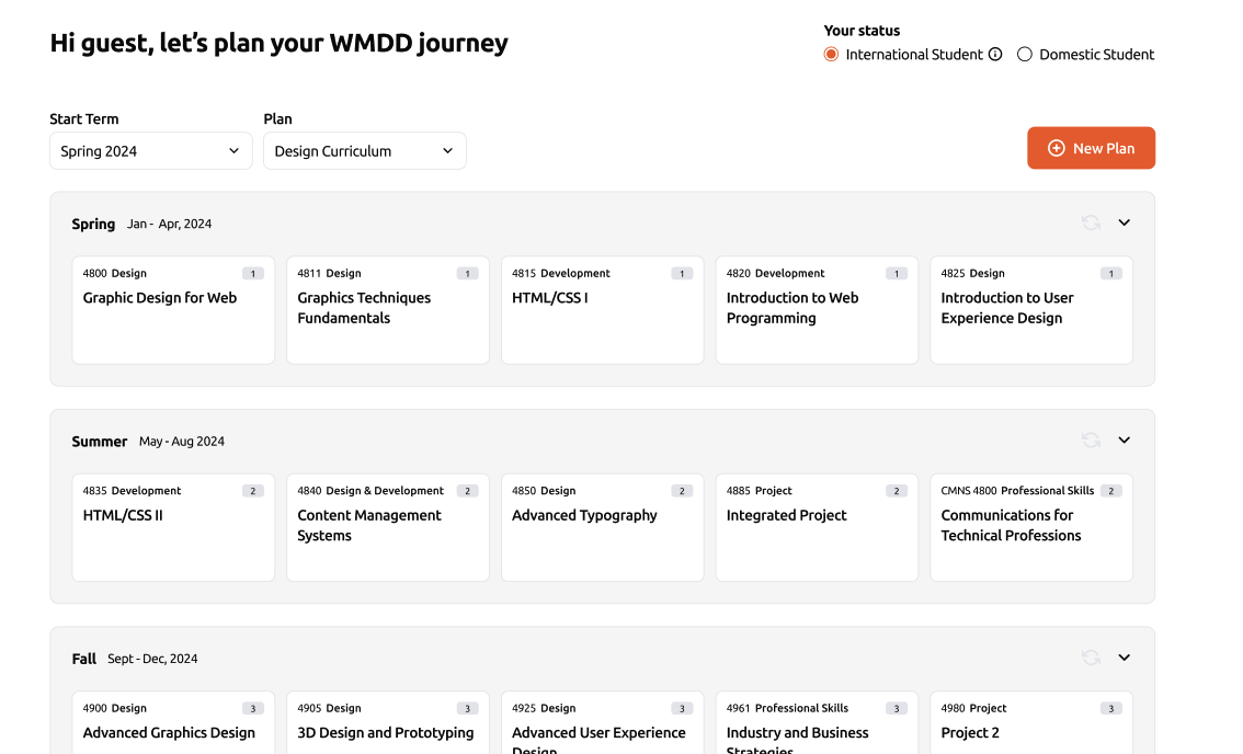
Redesigned as a vertical scrolling board, scalable for long-term planning and easier term-to-term comparisons.
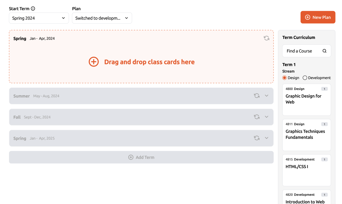
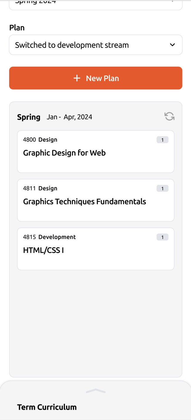
Iteration 2 – Stream Switching
BEFORE
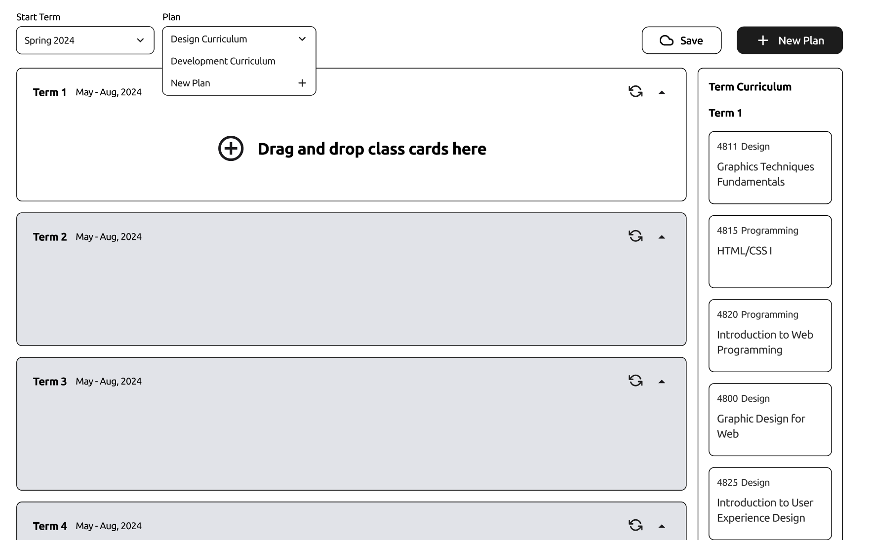
Students who switched between Designer and Developer streams mid-program had difficulty adjusting their plans.

AFTER
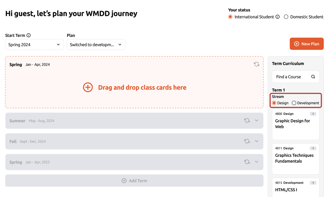
Enabled per-term stream switching within the curriculum repository, allowing flexible adjustments without restarting the plan.
Iteration 3 – Default Ideal Schedule
BEFORE
Students felt lost when starting a new plan, not knowing where to begin.

AFTER
Students felt lost when starting a new plan, not knowing where to begin.
Iteration 4 – Mobile Interaction
BEFORE
Drag-and-drop interactions were frustrating and error-prone on mobile.
AFTER
Replaced with a tap-to-select interaction, and added information icons to display course details without overwhelming the small screen.
Iteration 5 – Visual Requirement Feedback
BEFORE
Students often missed unmet requirements until it was too late.

AFTER
Introduced background color changes and toast notifications to visually alert users when prerequisites or requirements were not satisfied.
06
Features
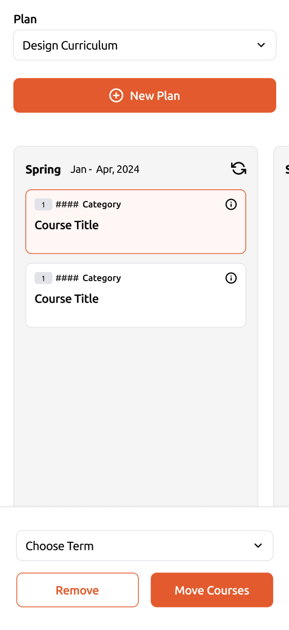
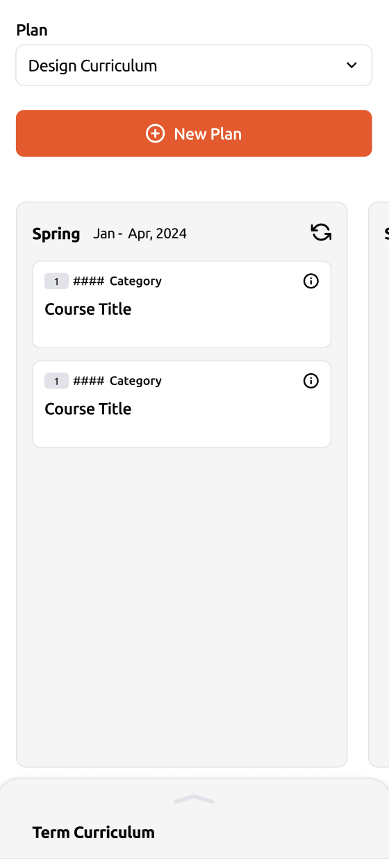
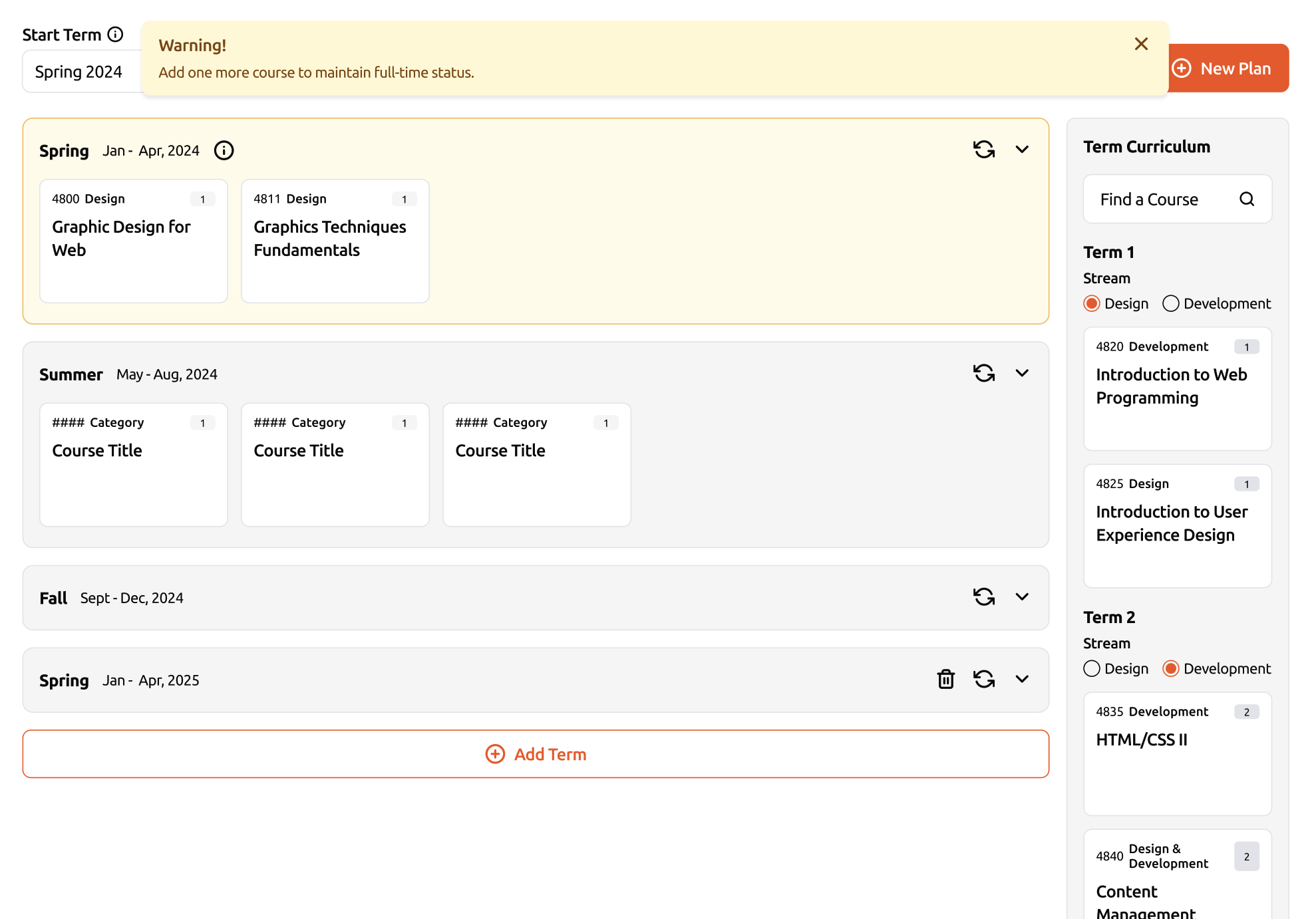
- Visual course planning board
- Prerequisite & co-requisite validation
- Credit tracking with visa alerts
- Drag-and-drop (desktop) / Tap-to-select (mobile)
- Multi-plan saving & stream switching
07
Challenges
- Designing for both desktop & mobile under system constraints
- Visualizing complex prerequisite logic without clutter
- Supporting multiple plans while keeping IA simple
- Ensuring scalability across programs
06
Impact
- Reduced repetitive student inquiries
- Boosted planning confidence & efficiency
- Improved visa compliance awareness
- Adopted beyond WMDD to other Langara programs
06
Takeaways
- IA-first design clarified complexity and improved usability
- Iterations were essential to refine both IA and UI
- If I had more time:
- Implement onboarding tutorial for first-time users
- Refine multi-plan comparison
- Add personalization features

Connect with me to explore your project's potential.


Course Planner
– Langara College
Role
Lead Product Designer
This guide defines the visual language, design style, and principles that shape a clear and consistent brand experience, no matter the team or area of expertise.
At its core, Redo is about precision and clarity—just like our mission to correct financial errors and optimize balance sheets. This guide lays out the essential design standards that bring our brand to life, from our color system and typography to accessibility benchmarks and documentation.
Whether you're designing for digital platforms or printed materials, these guidelines ensure every touchpoint reflects the trust and efficiency at the heart of Redo.
Contents
01
Target Users
- Stakeholders (Course Coordinator)
GOAL
Reduce repetitive inquiries and manual spreadsheet management
PAIN POINTS
- Manual spreadsheet management
- Time-consuming, repetitive communication
- Lack of scalable, automated planning tools
- Students (Domestic & International)
GOAL
Plan courses efficiently while meeting graduation and visa requirements
PAIN POINTS
- Confusion about prerequisites and co-requisites
- Difficulty planning multiple terms in advance
- Lack of clarity on credit requirements for visa compliance
- Manual, error-prone processes
02
Initial Thinking
We aimed to design an intuitive, self-service planner that would:
- Simplify academic planning for students
- Reduce coordinators’ repetitive workload
- Ensure compliance with institutional and visa requirements
RESEARCH METHODS
- Stakeholder interviews
- Student surveys and one-on-one interviews
- Observation of existing spreadsheet-based workflows
03
Design Process
- User Research
- Problem Definition
- Opportunity Framing
- IA restructuring
- Wireframing & Prototyping
- Usability Testing
- Iterations
- Delivery
04
Discovers
From research, we identified core issues::
- Confusion about course requirements: Students missed prerequisites and co-requisites.
- Difficulty in long-term planning: Lack of visibility across multiple terms.
- International student compliance: Uncertainty about credit loads required for visa status.
- Manual process: Time-consuming spreadsheets and constant back-and-forth with coordinators.
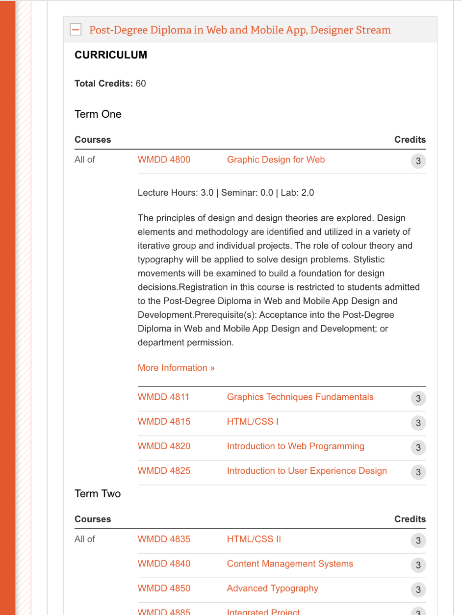
Incorrect Usage
05
Iterations
Iteration 1 – Term Board Layout
BEFORE
A horizontal board became unreadable as the number of enrolled terms grew.

AFTER
Redesigned as a vertical scrolling board, scalable for long-term planning and easier term-to-term comparisons.
Iteration 2 – Stream Switching
BEFORE
Students who switched between Designer and Developer streams mid-program had difficulty adjusting their plans.
AFTER
Enabled per-term stream switching within the curriculum repository, allowing flexible adjustments without restarting the plan.
Iteration 3 – Default Ideal Schedule
BEFORE
Students felt lost when starting a new plan, not knowing where to begin.
AFTER
Displayed an ideal sample schedule by default to provide clear guidance from the start.
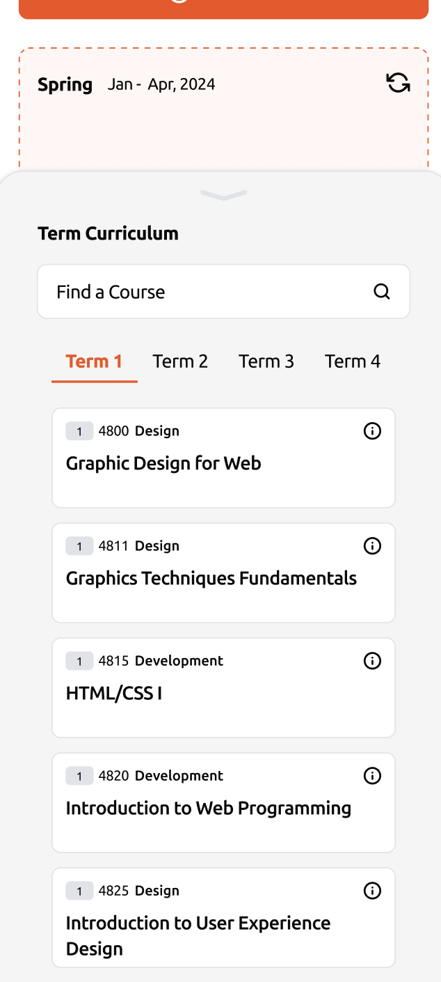
Iteration 4 – Mobile Interaction
BEFORE
Drag-and-drop interactions were frustrating and error-prone on mobile.
AFTER
Replaced with a tap-to-select interaction, and added information icons to display course details without overwhelming the small screen.
Iteration 5 – Visual Requirement Feedback
BEFORE
Students often missed unmet requirements until it was too late.
AFTER
Introduced background color changes and toast notifications to visually alert users when prerequisites or requirements were not satisfied.
06
Features
- Visual course planning board
- Prerequisite & co-requisite validation
- Credit tracking with visa alerts
- Drag-and-drop (desktop) / Tap-to-select (mobile)
- Multi-plan saving & stream switching
07
Challenges
- Designing for both desktop & mobile under system constraints
- Visualizing complex prerequisite logic without clutter
- Supporting multiple plans while keeping IA simple
- Ensuring scalability across programs
08
Impact
- Reduced repetitive student inquiries
- Boosted planning confidence & efficiency
- Improved visa compliance awareness
- Adopted beyond WMDD to other Langara programs
09
Takeaways
- IA-first design clarified complexity and improved usability
- Iterations were essential to refine both IA and UI
- If I had more time:
- Implement onboarding tutorial for first-time users
- Refine multi-plan comparison
- Add personalization features

Connect with me to explore your project's potential.


Course Planner
– Langara College
Role
Lead Product Designer
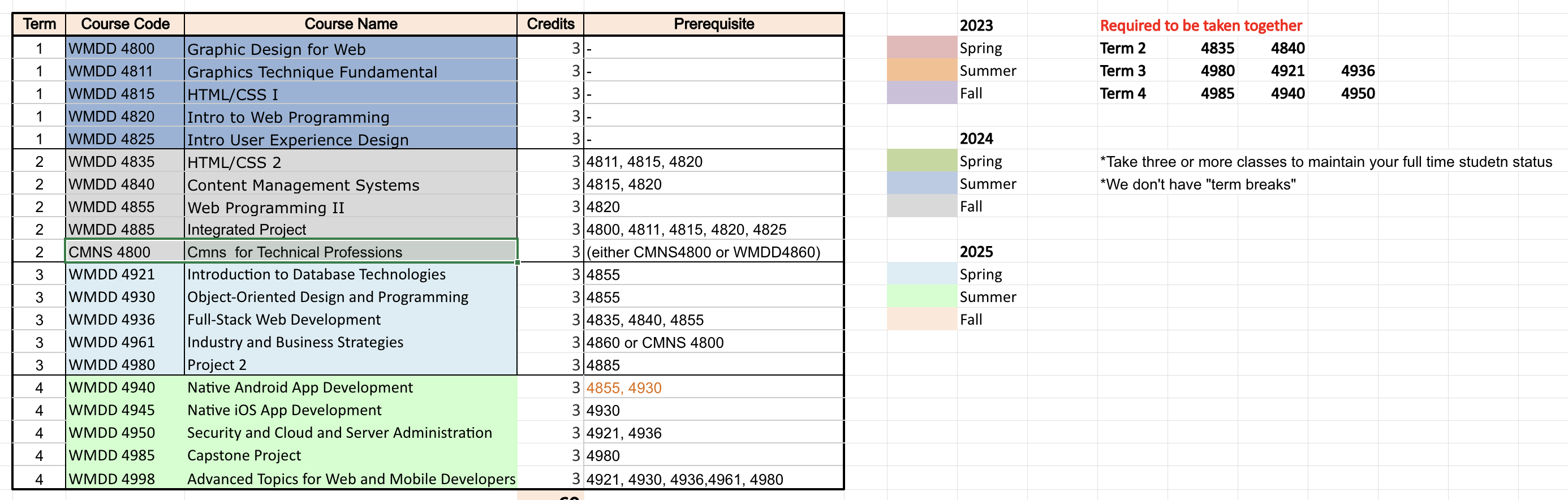
The Course Planner was developed for the Web and Mobile Design & Development (WMDD) program at Langara College. Previously, coordinators relied on spreadsheets to guide students through academic planning. This method was time-consuming, error-prone, and led to frequent student inquiries about prerequisites, co-requisites, and credit requirements.
The product aimed to reduce administrative workload while empowering students to plan their courses independently. Its success in WMDD led to adoption across other programs at Langara College.
Contents
01
Target Users
- Stakeholders (Course Coordinator)
GOAL
Reduce repetitive inquiries and manual spreadsheet management
PAIN POINTS
- Manual spreadsheet management
- Time-consuming, repetitive communication
- Lack of scalable, automated planning tools
- Students (Domestic & International)
GOAL
Plan courses efficiently while meeting graduation and visa requirements
PAIN POINTS
- Confusion about prerequisites and co-requisites
- Difficulty planning multiple terms in advance
- Lack of clarity on credit requirements for visa compliance
- Manual, error-prone processes
02
Initial Thinking
We aimed to design an intuitive, self-service planner that would:
- Simplify academic planning for students
- Reduce coordinators’ repetitive workload
- Ensure compliance with institutional and visa requirements
RESEARCH METHODS
- Stakeholder interviews
- Student surveys and one-on-one interviews
- Observation of existing spreadsheet-based workflows
03
Design Process
- User Research
- Problem Definition
- Opportunity Framing
- IA restructuring
- Wireframing & Prototyping
- Usability Testing
- Iterations
- Delivery
04
Discovers
From research, we identified core issues::
- Confusion about course requirements: Students missed prerequisites and co-requisites.
- Difficulty in long-term planning: Lack of visibility across multiple terms.
- International student compliance: Uncertainty about credit loads required for visa status.
- Manual process: Time-consuming spreadsheets and constant back-and-forth with coordinators.
Original planning resources
05
Iterations
Iteration 1 – Term Board Layout
BEFORE
A horizontal board became unreadable as the number of enrolled terms grew.
AFTER
Redesigned as a vertical scrolling board, scalable for long-term planning and easier term-to-term comparisons.
Iteration 2 – Stream Switching
BEFORE
Students who switched between Designer and Developer streams mid-program had difficulty adjusting their plans.
AFTER
Enabled per-term stream switching within the curriculum repository, allowing flexible adjustments without restarting the plan.
Iteration 3 – Default Ideal Schedule
BEFORE
Students felt lost when starting a new plan, not knowing where to begin.
AFTER
Displayed an ideal sample schedule by default to provide clear guidance from the start.
Iteration 4 – Mobile Interaction
BEFORE
Drag-and-drop interactions were frustrating and error-prone on mobile.
AFTER
Replaced with a tap-to-select interaction, and added information icons to display course details without overwhelming the small screen.
Iteration 5 – Visual Requirement Feedback
BEFORE
Students often missed unmet requirements until it was too late.
AFTER
Introduced background color changes and toast notifications to visually alert users when prerequisites or requirements were not satisfied.
06
Features
- Visual course planning board
- Prerequisite & co-requisite validation
- Credit tracking with visa alerts
- Drag-and-drop (desktop) / Tap-to-select (mobile)
- Multi-plan saving & stream switching
07
Challenges
- Designing for both desktop & mobile under system constraints
- Visualizing complex prerequisite logic without clutter
- Supporting multiple plans while keeping IA simple
- Ensuring scalability across programs
08
Impact
- Reduced repetitive student inquiries
- Boosted planning confidence & efficiency
- Improved visa compliance awareness
- Adopted beyond WMDD to other Langara programs
09
Takeaways
- IA-first design clarified complexity and improved usability
- Iterations were essential to refine both IA and UI
- If I had more time:
- Implement onboarding tutorial for first-time users
- Refine multi-plan comparison
- Add personalization features

Connect with me to explore your project's potential.

